Tuesday Tip: Using Color Psychology For Your Business Logo
It’s time for another Tuesday Tip! Today, we’re going to do something a little bit different and talk about using color psychology for your business.
You can watch our video here!
What Is Color Psychology?
Have you ever wondered why the McDonald’s logo is red and gold? Or why the Home Depot logo is orange? While these color choices may seem like a coincidence, they’re actually very important to a business’s logo and branding.
Color psychology is defined as “the study of hues as a determinant of human behavior“. Using color psychology, brands are able to influencer customers to buy their products or services. There are three main ways that businesses can influence their customers: influencing their perception of the brand, influencing their behavior, and standing out from the crowd.
Colors have a big impact on people’s perception of a brand For example, the Starbucks logo is green. The color green symbolizes health. While Starbucks is not a health foods store, customers may perceive it as a more healthy option than its competitors.
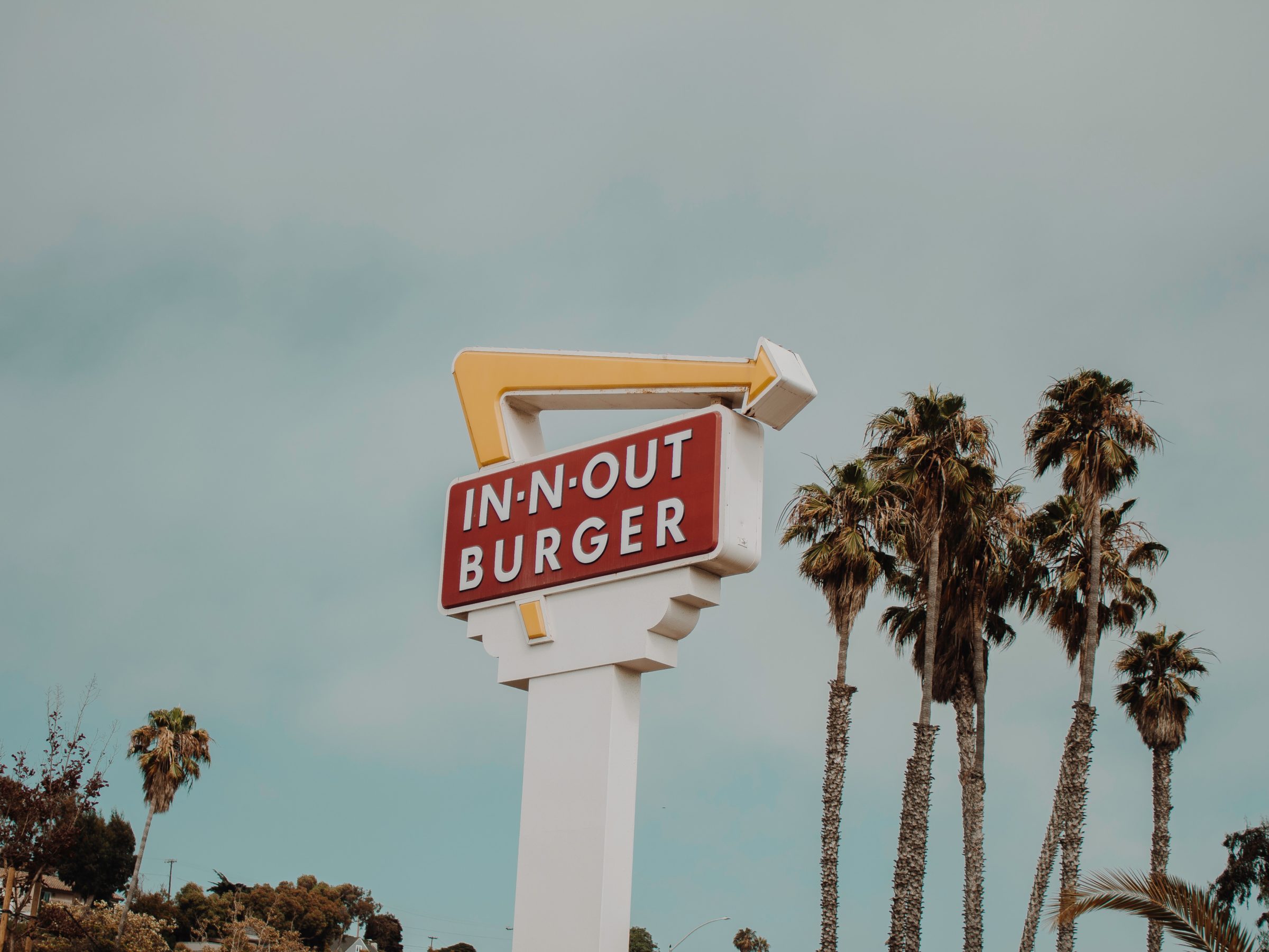
Thanks to studies in color psychology, we know that some colors may actually influence certain human behavior. For example, red is believed to increase hunger. This is why it’s such a popular color or restaurant logos, branding, and even decor.
Certain colors are better for standing out from the crowd. These are called “advancing colors” and are generally some shade of bright yellow . For example, Sprint’s logo is yellow and black. When the logo is placed next to its competitors, it tends to stand out. It also helps grab people’s attention when used on their store front, influencing people to come into a Sprint store before going anywhere else.
Colors In Branding
Since certain colors have certain meanings and psychology behind them, it’s important to take that into account when creating your business’s logo and branding.
Red symbolizes passion and is believes to increase hunger. This is why it’s a popular logo color choice for restaurants and fast food chains like McDonald’s.
Orange symbolizes both warmth and caution. This is why it’s a popular logo color choice for home improvement stores, like Home Depot, and children’s brands, like Nickelodeon.
Green symbolizes health and nature. Its a popular logo color for stores that want to seem healthy, like Whole Foods and Starbucks.
Blue is commonly used to market products aimed towards men. It’s a key color for male customers to quickly identify if a product is made for them.
Pink is commonly used to market products aimed towards women. Like with blue, pink is a key color for female customer to quickly identify if a products is made for them.
Black represents luxury and sophistication. It’s also a popular logo color choice for tech companies.
Using Color Psychology For Your Business
When choosing the logo colors for your business, think about what it offers to the world. Then, use the colors that represent your brand using color psychology. The color you use in your branding can really make a difference in getting an edge over your competition!